Tableau 8.2 with the new feature 'Story Points' was recently released - and great things are in store for data visualizers and story tellers!
At its core, Story Points is a tool for better communicating and sharing your insights and discoveries with your audience. It basically lets you construct a presentation where you can build a narrative while still taking advantage of all the interactivity. You as the presenter or the audience as explorer can filter, zoom, select data, and access tooltip information and underlying data just as if it were a normal workbook. Only now it will be packaged in a presentation format with a narrative structure and layout defined by you as an author - pretty nifty! The narrative may be your story of the discoveries and conclusions you have made while working with the data, or it may be more of a guided tour through the information.
For instance, if you have one or more dashboards, you can break down the journey through the information into a series of sequential steps that build up a more natural presentation-like story. Instead of just publishing or distributing the workbook, let alone copying static images to a presentation, you can now use Tableau Story Points to stage a fully interactive presentation. Either to be used by you as a presenter or for your audience to explore on their own. Now that's a tool with power and points! It enables you to engage and bring together your data and your audience - much opposed to the common presentation software out there today!
How does it Work?
Let's say you have a dashboard where you have set the selections or filters in order to communicate a specific insight. Going to the new menu item Story, simply drag this dashboard from the side bar into a blank story point. Tableau will now make a fully interactive snapshot of your dashboard, remembering all your settings (i.e. selections, filters etc.). You can now add annotations and descriptions to the canvas as you please without affecting the underlying dashboard. Thus, if you duplicate the story point you just made, you can make additional, customized story points from the same dashboard and let your story/presentation evolve as the story you want to tell.
All the story points of your presentation are visible in the Navigator, a clickable and scrollable bar at the top of the display area. Here you can name the steps and easily decide their sequence by merely dragging and dropping the individual story points. The Navigator adds a great and intuitive way for letting you or the audience navigate through the story - either working through it sequentially or by picking particular points of interest. The text boxes in the Navigator are fixed size with a scroll bar if you exceed three rows, so you are put to the test when it comes to finding a rich but short headline for each of your points. I am not an expert of storytelling, but I do find that keeping things short and to the point is good practice and an indispensible skill when communicating information; therefore I actually like the challenge present in the structure of the Navigator.
The Navigator: Presenting and providing easy navigation of the elements of your story.
A common ground for data visualization and storytelling
In the last couple of days I have given Story Points a whirl in the 8.2 beta version. It has been fun and interesting and I am impressed with the increased potential for doing better storytelling wihin Tableau. So thank you Tableau - this is a excellent addition to an already great product!
One thing that I quickly realized when doing my first Story Point presentation was that although I now had a great tool for making the presentation, the story teller was not included. So you may find, as I did, that there is a whole new set of communication skills that you need to acquire or look into now, or that it could be very beneficial to ally yourself with a journalist or another person trained in wording the actual story. Actually, it just goes to show how the story teller and the data visualizer are extremely dependent on each other. If there is no important story to tell, why bother analyzing and visualizing the data? And if there are no easily digestible data or insights available, the stories will, at best, be fairytales. So I guess it will be interesting to see if Tableau Story Points can provide not only an important common tool between the story tellers and the data visualizers, but maybe even a new common ground between the two.
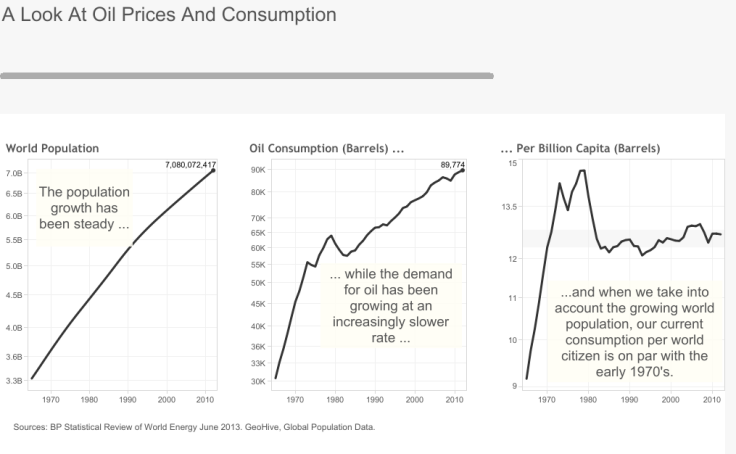
Anyway, in the presentation below I am having a look at the history of oil prices. I have used a little data and a great deal of inspiration from some of the great story tellers at New York Times. Take a little tour in the presentation - and experience some of the merits of Story Points - I am certain we will see lot more of this type of presentation in the years to come.

Any questions?
Please reach out to
info@inspari.dk or +45 70 24 56 55 if you have any questions. We are looking forward to hearing from you.


