3 min læsning

Redesigning existing charts has become a popular way to learn more about data visualization.
Blogs such as Junk Charts, Storytelling with Data, The Functional Art and many others continue to demonstrate how small design changes can significantly improve the way information is communicated.
It is easy to understand why.
Taking an existing visualization apart, questioning the design decisions and rebuilding it is one of the best ways to develop your own visualization skills.
I spend a lot of time teaching data visualization, but I still consider myself a student. There is always something new to learn – and the web remains a fantastic source of both inspiration and discussion.
In this example, I'll redesign a stacked bar chart into a diverging stacked bar chart, since the data represents responses on a rating scale.
One of my favorite sources of inspiration has always been The Wall Street Journal, and this particular visualization immediately caught my attention.
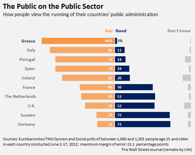
The chart essentially displays the results of a satisfaction survey on the public administration in selected European countries. It points to some alarming regional differences - no doubt - incurred by the severe economic crisis in the Euro zone. I think it is a nicely designed chart! The use of bars makes it easy to rank the countries, and by highlighting Greece, focus is put on it as the country with the greatest lack of confidence in the public sector. The colors are pleasant to look at and work well. Overall, this is what you can expect from a WSJ visualization.
So why construct the chart differently? Well, I believe a couple of things could be improved to leverage better comparisons and providing visual cues as to the hierarchy in the information. Firstly, the 'Don't know' category does not really add any information. If the respondents simply don't know, we cannot regard them as being truly neutral with regards to the question of good or bad, so why place them in the middle? Furthermore, their presence in the middle makes it harder for the reader to do the interesting comparisons. I therefore choose to move them to a less prominent place in the chart, but maintain the categories 'Bad', 'Good' and 'Don't know' in stacked bar.
Secondly - but more importantly, I want to be able to better compare the lengths of the 'Good' and 'Bad' bars, and I want to see how each category diverges from a neutral position (0). So, applying an X Scale from -100 to 100 (in stead of 0-100), I create a vertical baseline in the middle of the chart (at 0), placing 'Bad' to the left (negative) and 'Good' to the right (positive). This is a simple form of a so-called 'Diverging Stacked Bar Chart' often used to display results on rating scales (e.g. satisfaction survey results ranging from Very dissatisfied to Very satisfied). Now my two main categories have a common, fixed baseline leveraging good comparisons. I can easily compare the bar lengths and see which countries are skewed to the left and the right of the 0 line.
Also, since it is the main character in the story, I place Greece on top by sorting on the 'Bad' category. I maintained the visual cues provided by stronger color and font for Greece. Finally, as I generally prefer my labels to be tightly related to their chart elements, I aligned the country names to the right.
And that is enough for today - as mentioned, the original chart is quite well done to begin with. But I do love to visualize data - and often times, data visualization is basically a matter of making a few, simple, yet playful adjustments to an existing one. The data remains the same - the picture alters - the information unveils and unfolds.
Next time you see a visualization that works well or the opposite - try considering how you would have communicated the same data. And if you are up to it - do your own remake; I promise you it is a process of learning and discovery. Who knows, perhaps you will even let us know how it went...
Any questions?
Please reach out to info@inspari.dk or +45 70 24 56 55 if you have any questions. We are looking forward to hearing from you.
Relaterede Posts
Enhancing the pattern by keeping text in check
Text is an indispensable helper when we make data visualizations, but we need to be careful not to...
Do you know C.R.A.P. when you see it?
If you popped by this blog, chances are that you work with BI or data analysis or just find...
Inspari lancerer systemer til ESG-rapportering, energioptimering og bedre bygningsdrift
Den ene automatiserer ESG-rapporteringen og indsamling af ESG-data. Den anden gør bygninger...